Independent Teacher Brand Strategy
Full Blown Digital Restructure
Project Responsibilities:
Web Design + Development
Visual Identity
Brand Strategy
Graphic Design
Content Strategy
Creative Direction
Logo Creation

Raise your hand if you need a website
Project Overview

From Scratch.
The website was designed with a primary focus on providing comprehensive information about Ms. Reese’s teaching services, facilitating easy online bookings, and establishing a sense of legitimacy and professionalism for her business. The site serves as a central hub for potential clients to learn about her educational approach, view her credentials, and seamlessly book her services.

The Building Blocks
Elements of the Visual and Brand Identity
Color Palette
The chosen color palette is inspired from the building blocks one would interact with.
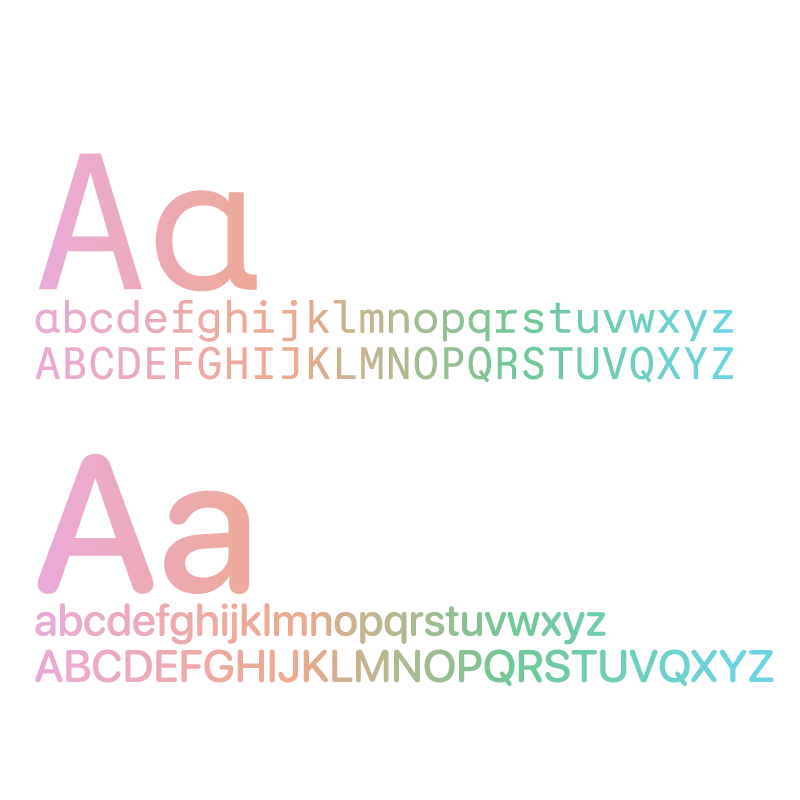
Typography
The font is intended to be blockier, making it remind users of the similar feeling of the palette.
Iconography
We designed a set of unique icons that represent various aspects of Ms. Reese's teaching practice.
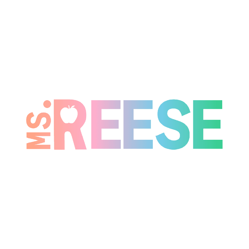
Logo
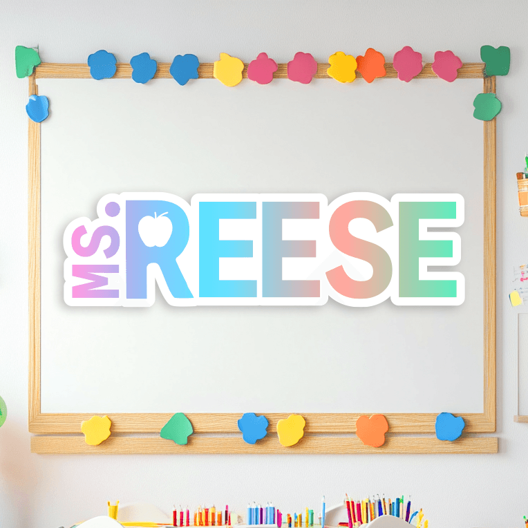
It features a clean, modern typeface paired with a subtle educational motif, reflecting her dedication to teaching and her students' success.
Brandmark
The brandmark, a distinct visual element derived from the logo, serves as a recognizable symbol of Ms. Reese’s brand.
Copy Direction
The tone is friendly and approachable, yet professional, aiming to build trust and encourage potential clients to book her services.

Easy as ABC… 123…
0 to 1 Visual Identity Creation and Direction
Patterns.
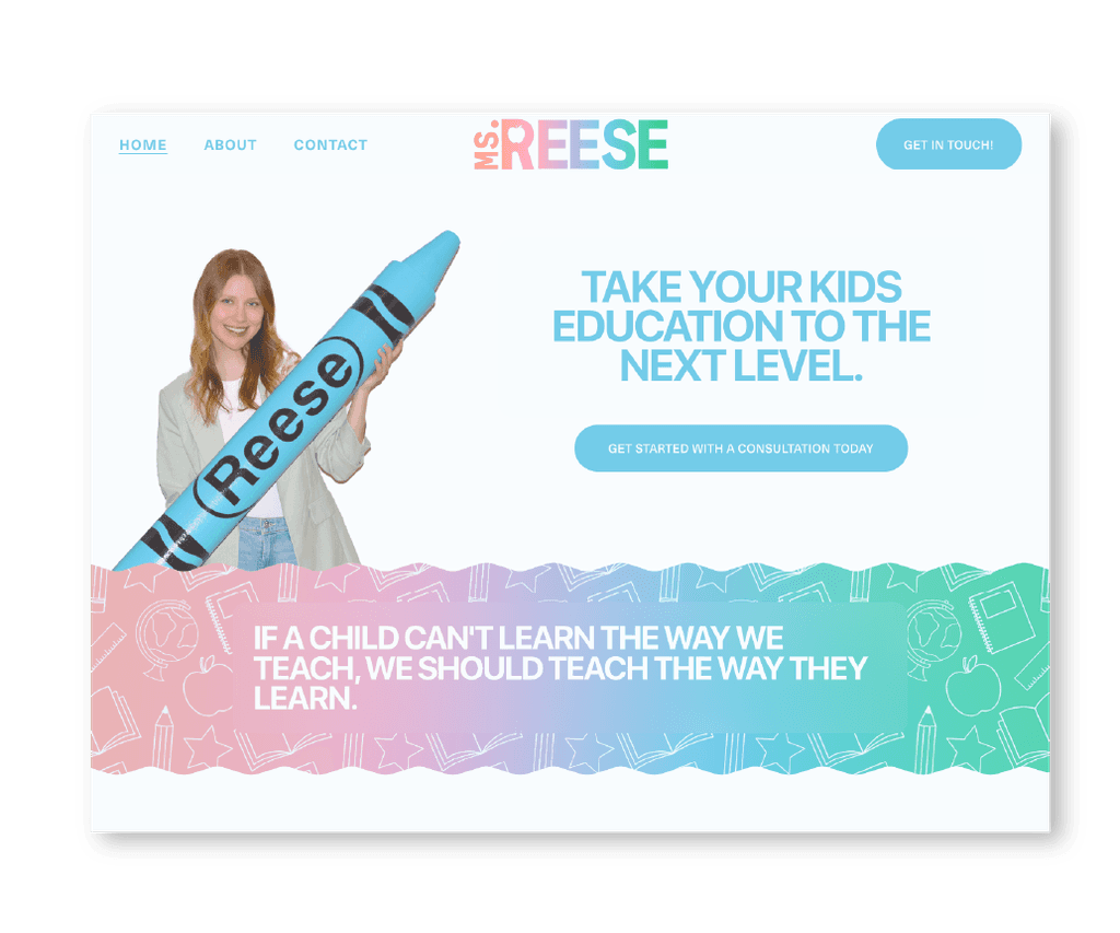
Subtle patterns are used to add texture and depth to the site’s background, making the pages visually appealing without distracting from the content.
Use of Color
Blue brings calm and trust, green symbolizes growth and harmony, yellow radiates energy and joy, while pink adds a touch of creativity and warmth. Together, they create an inviting and imaginative experience for Ms. Reese's clients.
Keep it Consistent.
To ensure a cohesive user experience, we maintained a consistent visual style across all pages. This includes the use of the same color palette, typography, and design elements, reinforcing Ms. Reese's brand identity.
Photography
The photography on the site is authentic and relatable, featuring Ms. Reese interacting with her students. This approach helps build a personal connection with the site visitors.

You Get a Gold Star
Page Structure and Rationale
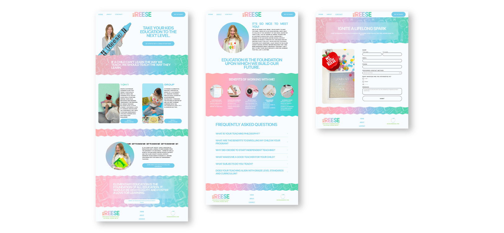
Home
The home page is designed to make a strong first impression. It features a welcoming introduction to Ms. Reese, highlights of her teaching approach, and easy navigation to key sections of the site. Custom graphics and engaging photos set the tone, inviting visitors to explore more.
About
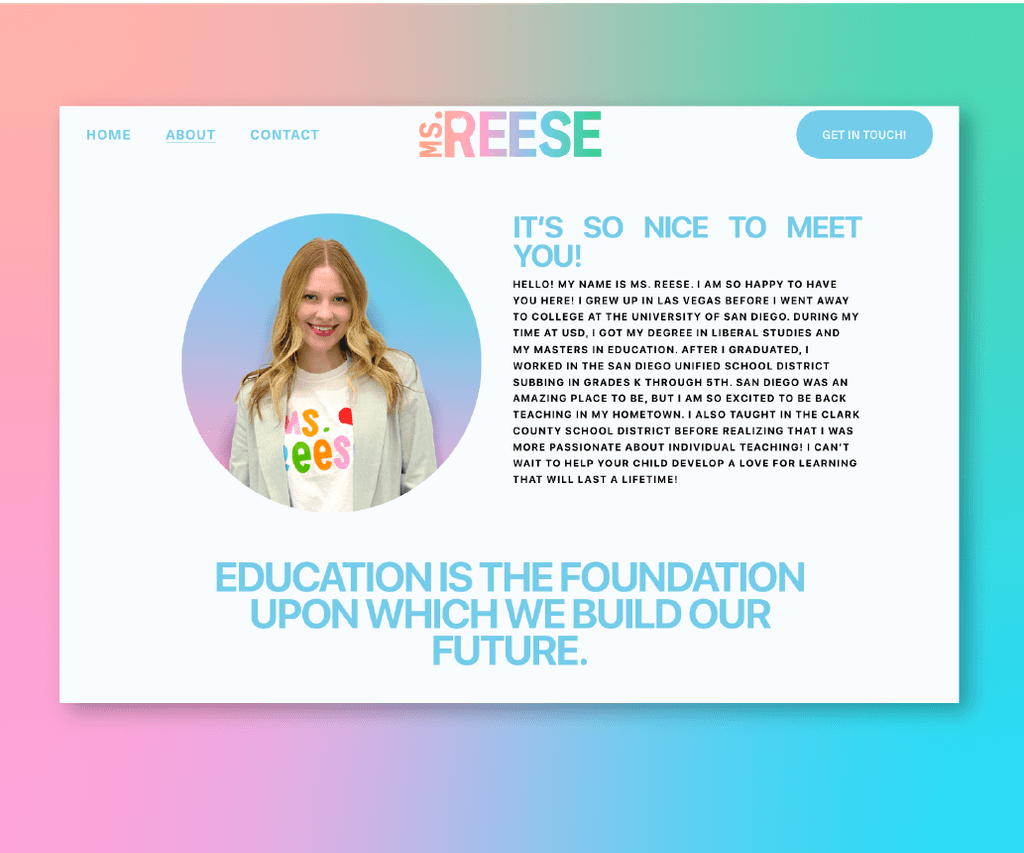
The About Me page provides a deeper dive into Ms. Reese’s background, teaching philosophy, and accomplishments. Personal anecdotes and professional milestones are highlighted, supported by warm, inviting visuals that reflect her passion for education.
Contact
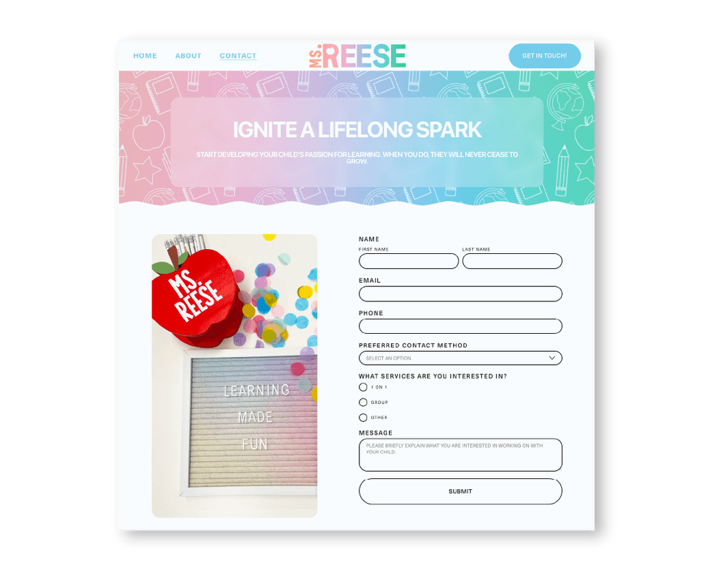
The Contact page is simple and user-friendly, making it easy for parents and students to get in touch. Clear contact forms, and direct links to email ensure seamless communication. The design is clean, with supportive icons and consistent branding elements.

Wrap it Up!
Project Reflection.
Working with Ms. Reese was an incredible opportunity to bring her vision to life completely from scratch. Deciding to take a bet on herself, Ms. Reese was in the very beginning stages of taking a building our her business. Together we were able to launch her independent teaching business with a consistent look and feel that showcases her own individuality while remaining professional, offer clients a portal to learn more about her and build trust along the way.

Reese Hodapp
Owner and Founder of Ms.Reese
Working with Cage and Tusi was an enjoyable experience from start to finish. As someone who freely admits to being a tad high maintenance (okay, maybe more than a tad), I was truly impressed by Cage's extraordinary patience and unwavering grace. Throughout the entire process, Cage maintained clear and consistent communication, meticulously incorporating every scattered idea I threw his way. From conceptualizing a captivating logo to meticulously crafting a cohesive color scheme, and from arranging stunning brand photography to fashioning a seamlessly functional website that surpassed all my expectations, Cage consistently went above and beyond. His dedication to his clients and his craft is nothing short of exemplary, making him an undisputed leader in his field. Choosing Cage was one of the best decisions I made for my project, and I wholeheartedly recommend him to anyone seeking a partner in bringing their vision to life.
