Wellness Brand focused on scaling
Taking things more serious and hunkering down on their digital presence, we were tasked with helping to bring their vision to life across web, social media and email to give everything a comprehensive feel across all mediums.
Full Blown Digital Restructure
Project Responsibilities:
Web Design + Development
Visual Identity
Brand Strategy
Graphic Design
Content Strategy
Creative Direction

Project Overview
What once was…
SP Wellness had a lot of amazing information available already on their site. We wanted to freshen everything up and give the site a little more life.
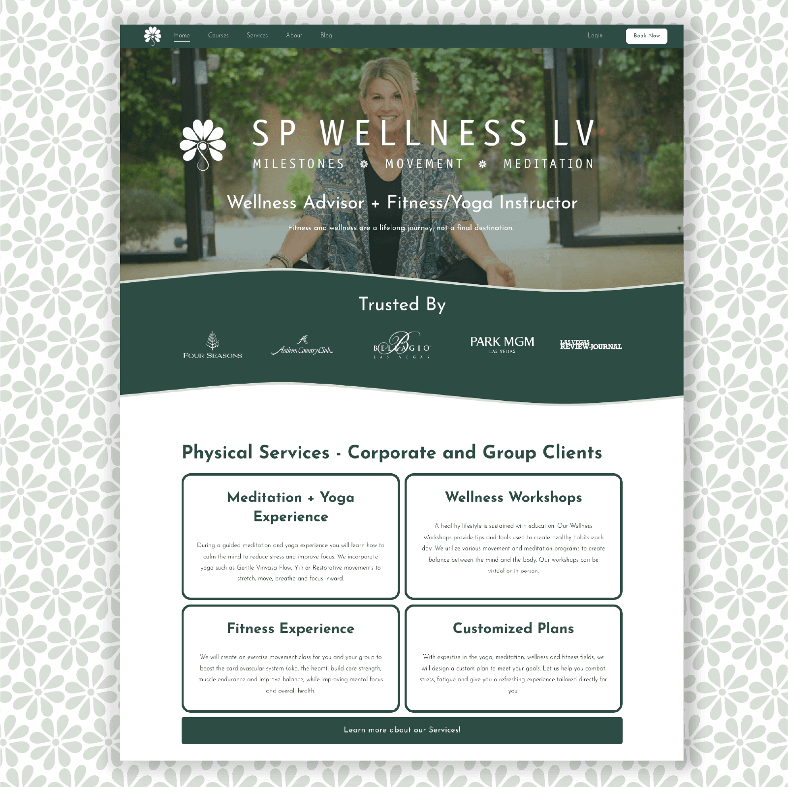
To what is now.
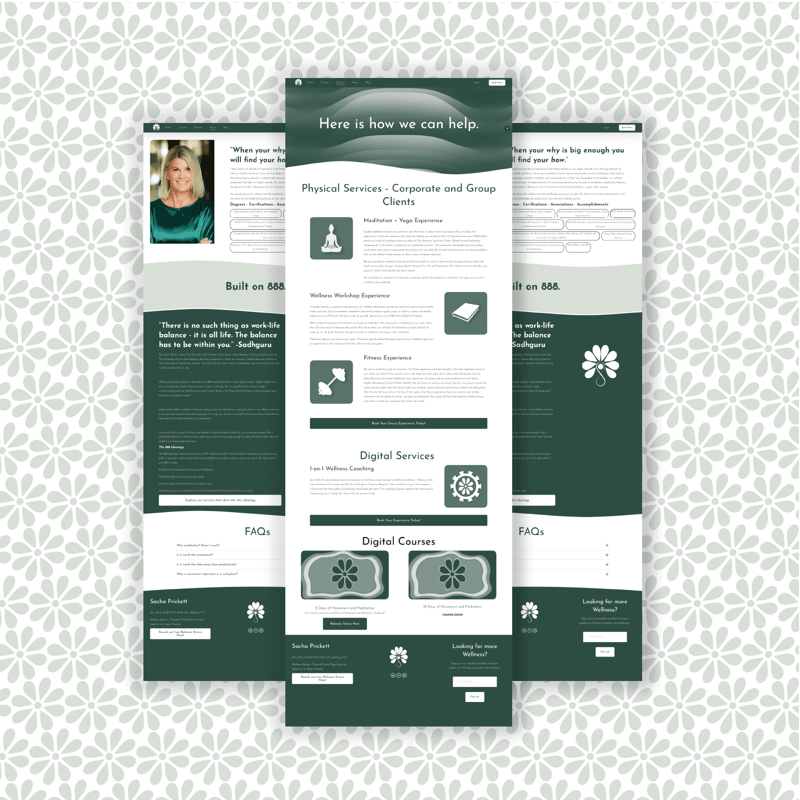
We restructured the site to improve the user flow to get to the information they desire while drastically improving the overall look and feel.

Wow thats a lot, so what happened?
The changes and subtle nuance's explained for those who care.
Color Palette
Utilized darker greens to evoke tranquility and connection with ones self.
Information Architecture
Streamlined for intuitive navigation and seamless user experience.
Consolidated Pages
Integrated content for clarity and accessibility.
Copy Direction
Inviting and warm, encouraging exploration and participation.
Graphical Additions
Custom graphics enhancing visual appeal and storytelling.
Animations and Depth
Subtle animations added depth and interactivity, enhancing engagement.

The Beauty of… Beauty?
Graphic Design and Visual Purpose
Storytelling.
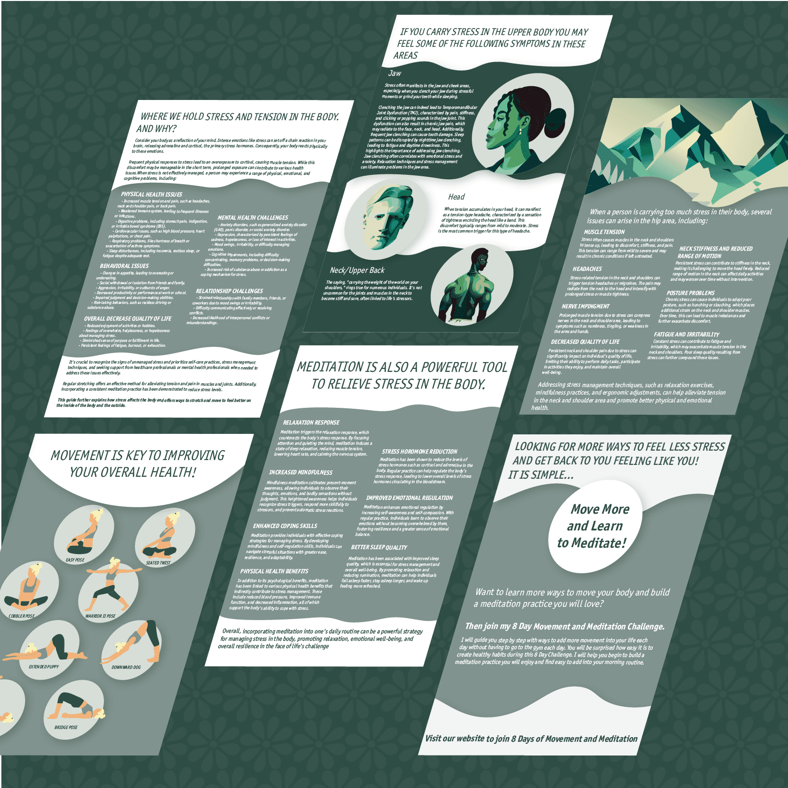
Sometimes a lot of copy is… well a lot. We chose to break these elements up with some engaging service graphics.
Consistency of Logo Elements
SP Wellness already had a logo they loved, it was just buried deep on their site. So, we took this logo and had it be the inspiration behind our course graphics and various small details throughout the entire brand, really bringing everything together.
Taking it Across Various Mediums
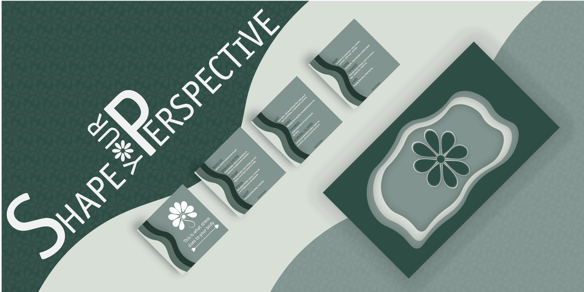
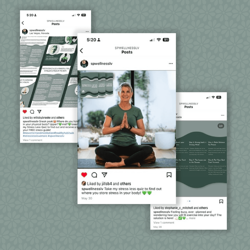
Engaging Social Media Posts, Newsletter Logo, Video Animations. We creating a library of assets for SP Wellness that keep everything on all platforms consistent.
Guides + Content
Educating their customers on the benefit of wellness has never been easier.

Whats New?
0 to 1 Concepts to Ideation
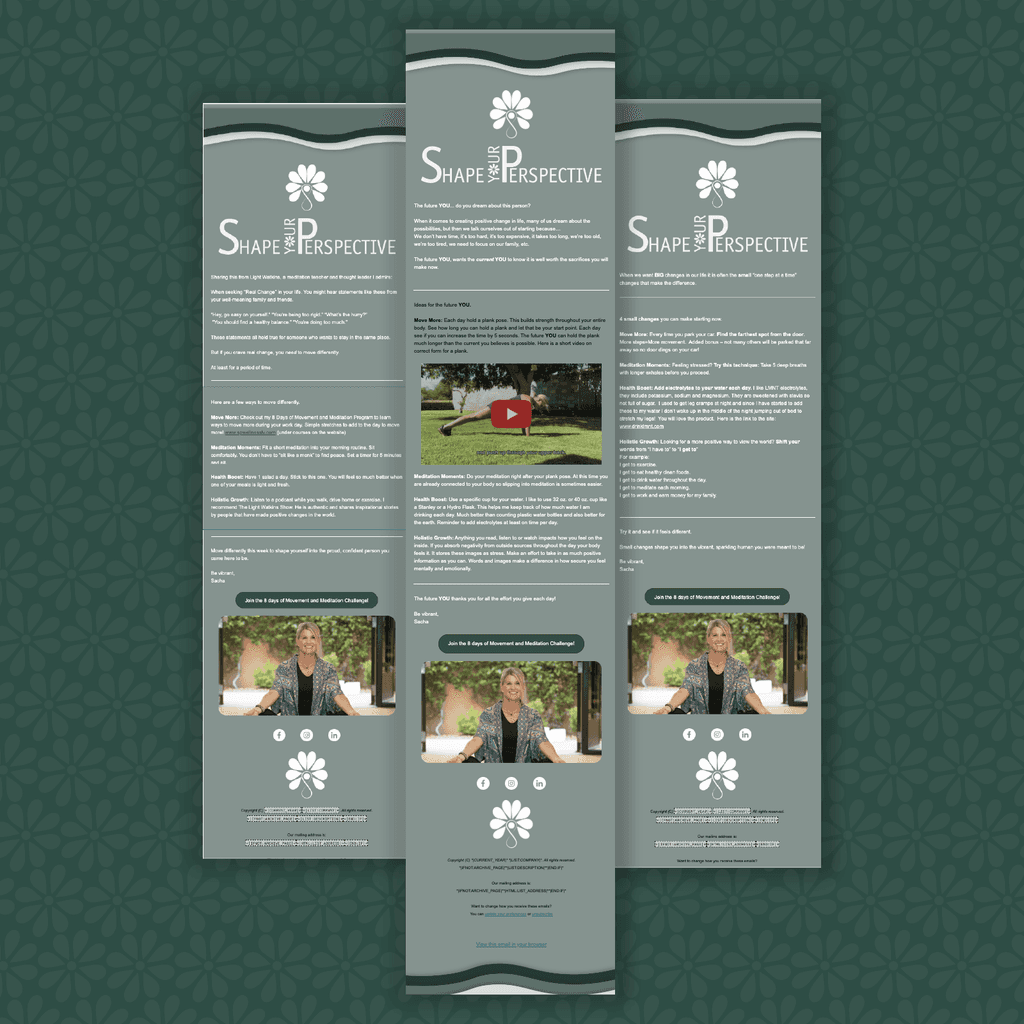
Newsletter
Putting our heads together we came up with the name Shape Your Perspective and the logo is inspired by… well… changing your perspective
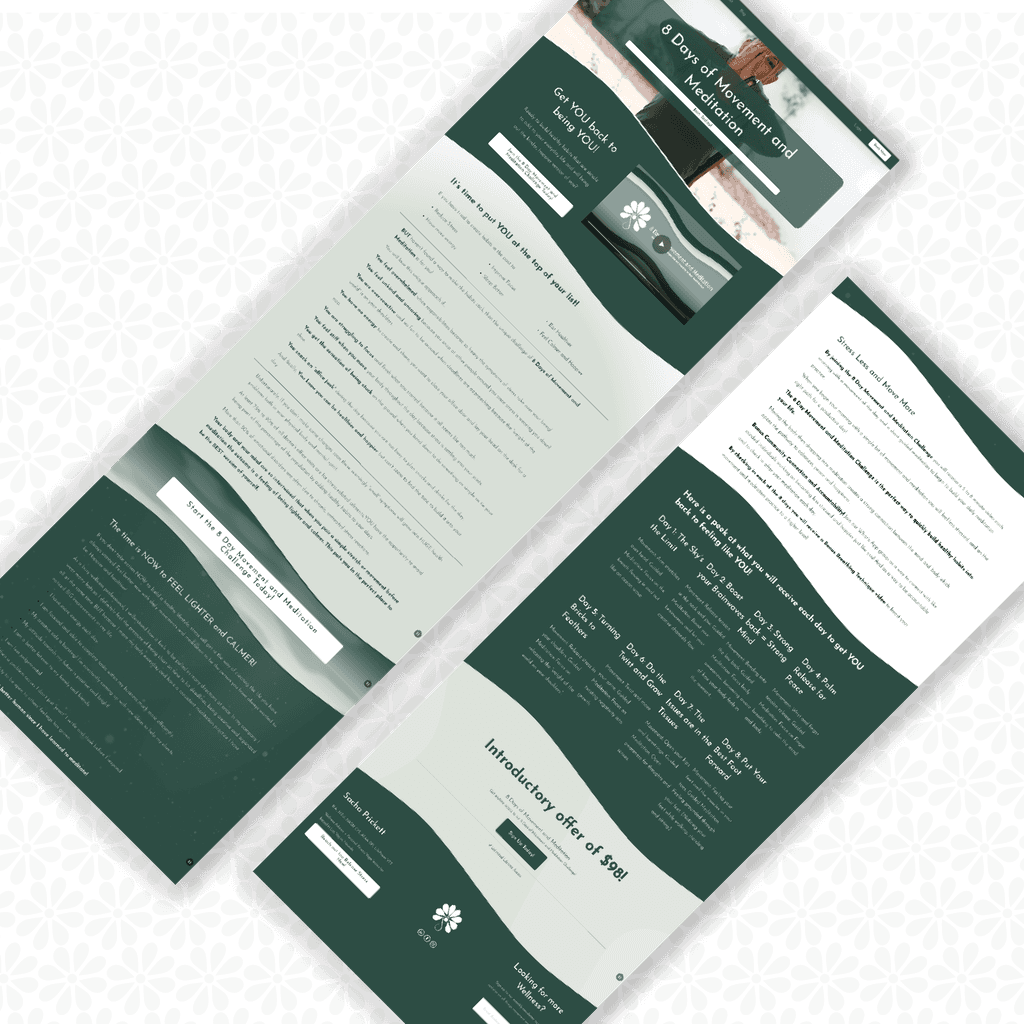
Courses Page
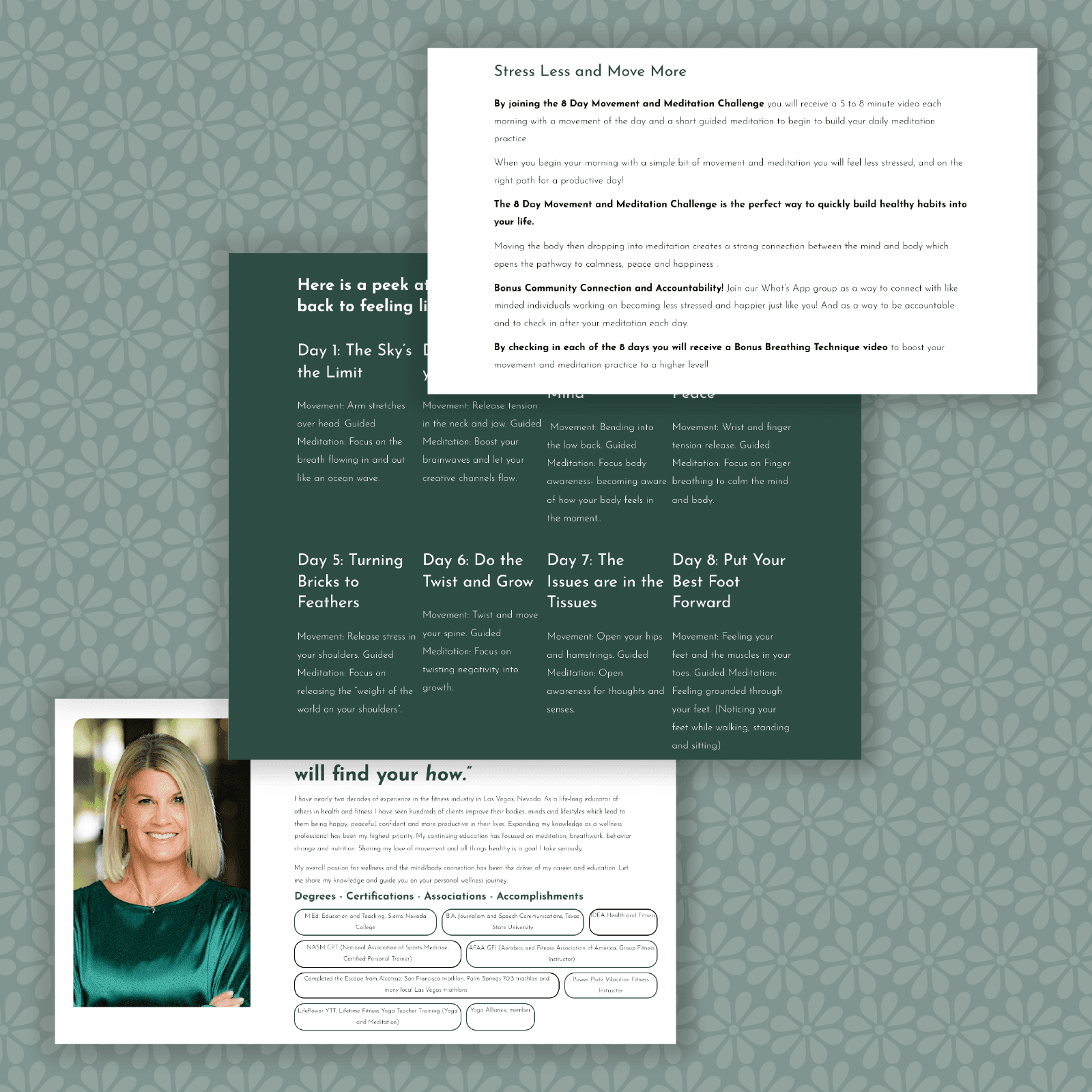
SP Wellness is just starting to get into Digital Services, and they needed a kick ass course to start this off. The 8 Days of Movement and Meditation challenge is just the beginning!
Social Strategy
SP Wellness was already killing the social game. We took this a step further by creating a posting schedule and providing content direction, along with creating graphics when needed!
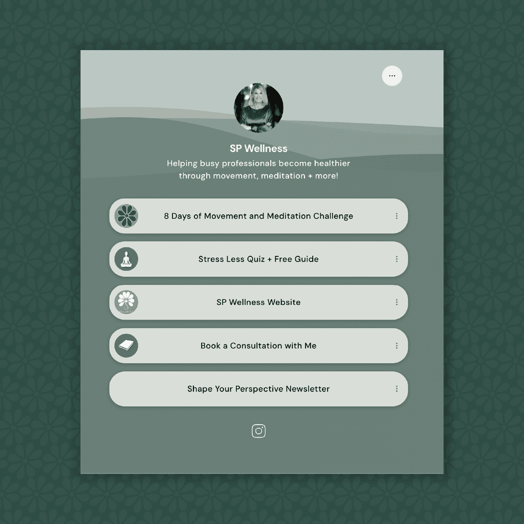
Linktree
Link in Bio! With the new focus on growing a social following we needed customers to engage with all we created. Of course we never skip the details, so we crafted a perfectly on brand Linktree experience.

Its the little things.
Details and small tweaks.
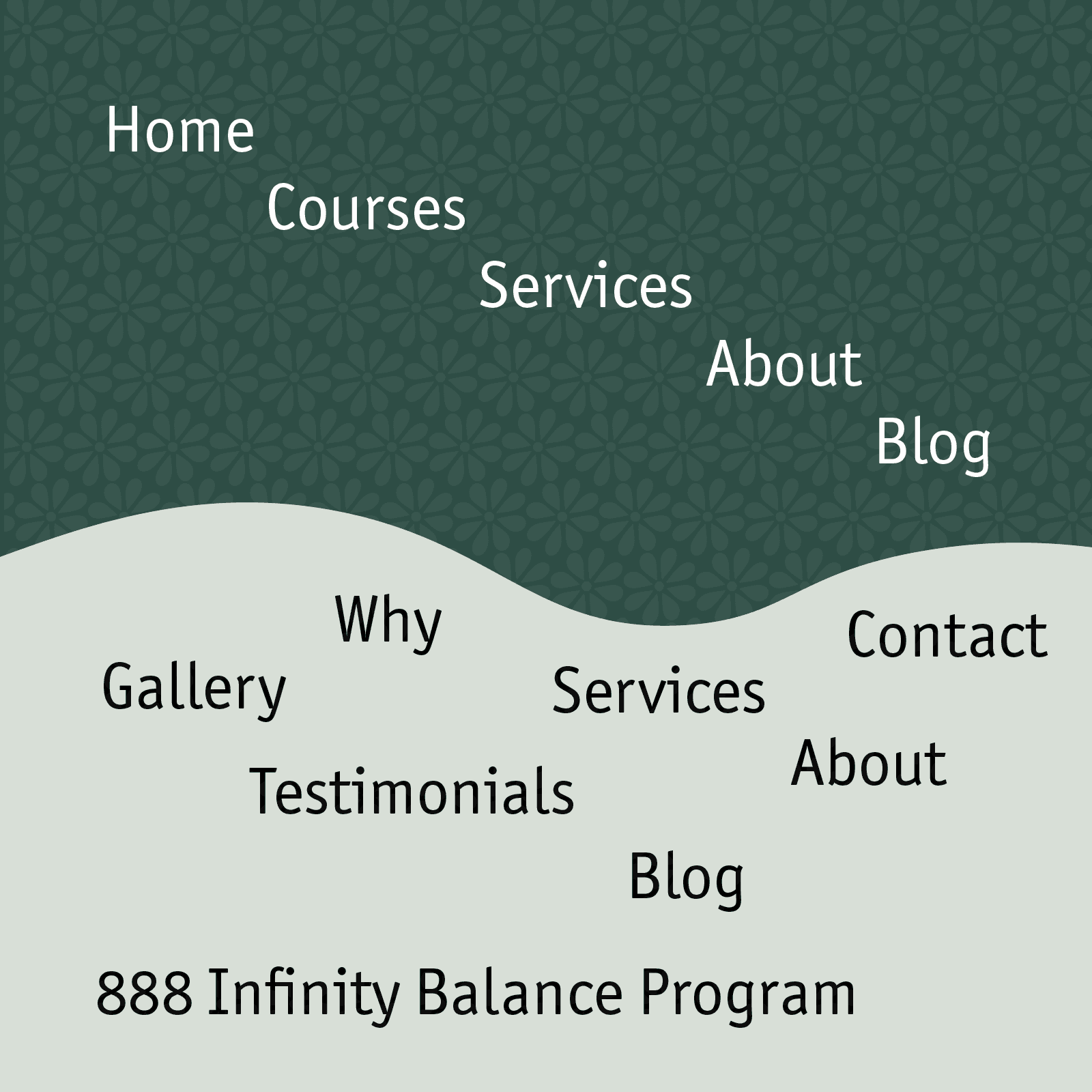
Consoldiated Navigation
Sometimes less is more in the eyes of your user.
Effects
Use effects like Transforms and Parallax scrolling to add depth to the site.
Typeform Quiz Integration
Connected an existing typeform to increase lead generation on the site.

Wrap it Up!
Project Reflection.
Working with SP Wellness was been an incredible experience. Its always such a blast getting to work along side someone who is truly passionate about what they are doing. Helping to take SP Wellness to the next level with sharpening their digital presence and honing their visual identity was an awesome challenge that allowed for both of us to take a step back and be immensely proud of the end result.
What started as a refresh to the website turned into a complete rebrand project, where we took existing elements and made them make more sense. Pairing intentionality with UI/UX principals the website is now a tool for information gathering, digital course taking, client aquisition and lead generation.

